I've - finally - changed my layout to something less.. childlike?
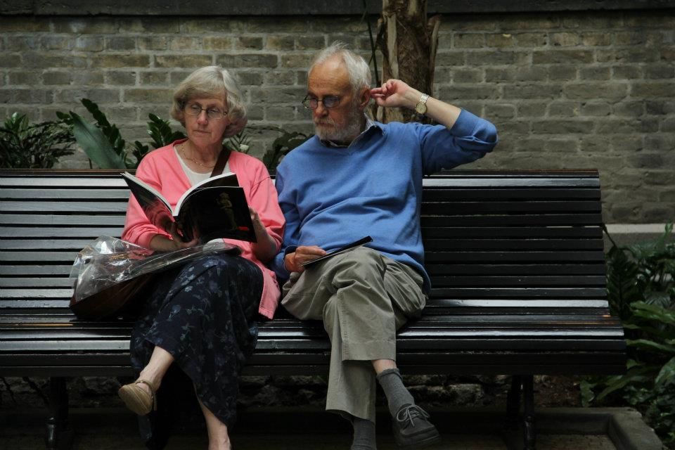
This photo was taken outside a gallery in Copenhagen, it keeps me calm. I didn't change the header 'fire' because I do not know of any other favourite word.
It does sound like a pretty good title for this photograph though.
(an attempt at art theory all over again hahaha)
Visually, the word kind of contrasts with the image - there's no 'visible' wild burning passion, yet you can feel the burning flame in the couple via their simple act of reading side by side. They're not directly communicating here, but he's interested in what she's reading. Also, the fact that they're both at the museum says something, I think - enjoying something together. It's different from many aged couples where one watches telly at home and the other reads. Or something.
Then again, this photo could be read differently.
-
Also feel like symbols ? @ ~ + are greater representations of the categories on the left. They used to be "me", "tagboard", "archives" and "links".
This new font Cambria looks better than Calibri as well.
The odd script left from the designer has been removed as well. Almost everything's been changed though.
Just for my own reference in case I change the picture in the future:

No comments:
Post a Comment